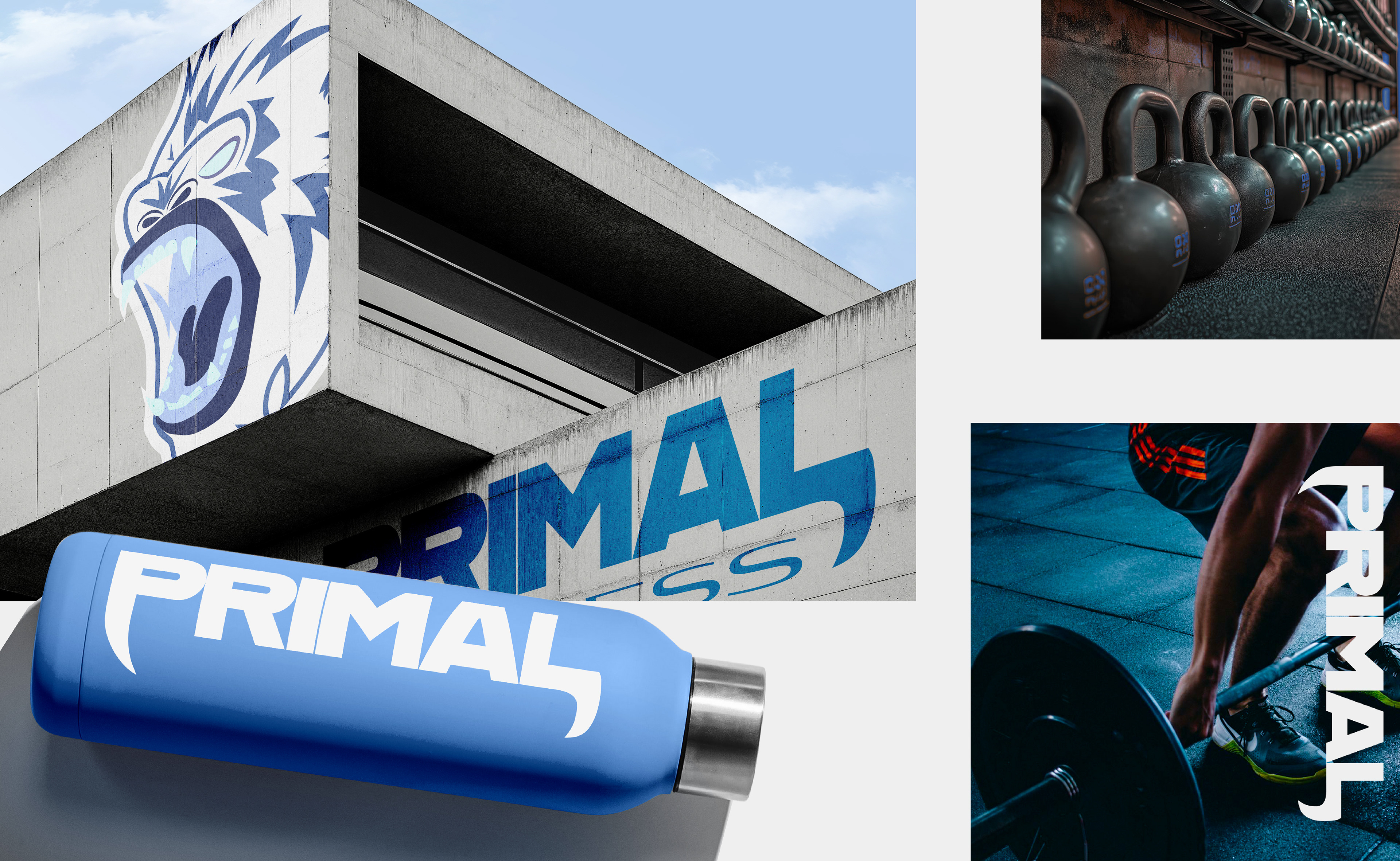
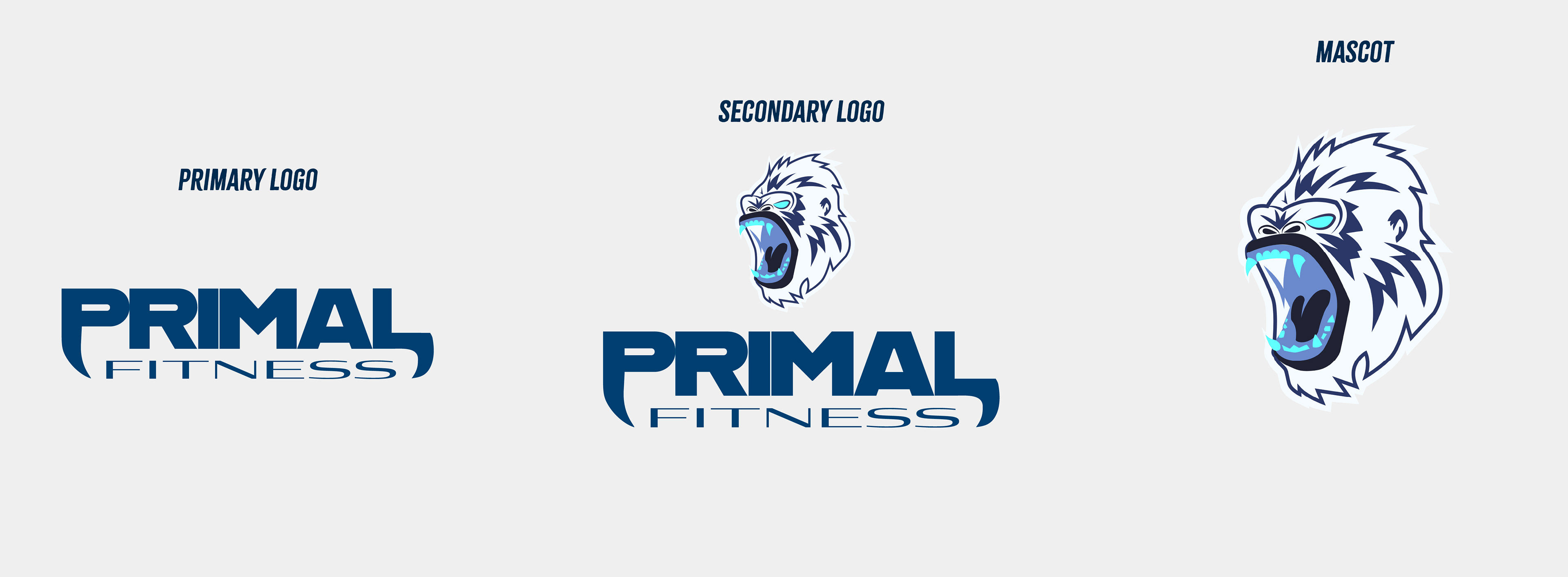
Primal Fitness's logos embody the raw, untamed spirit of your training philosophy where primal power meets modern athleticism.
The bold, unapologetic lettering commands attention like a Yeti's roar, while the mascot adds a touch of wild personality.
This isn't just branding, it's a battle cry for those who train with savage intensity.
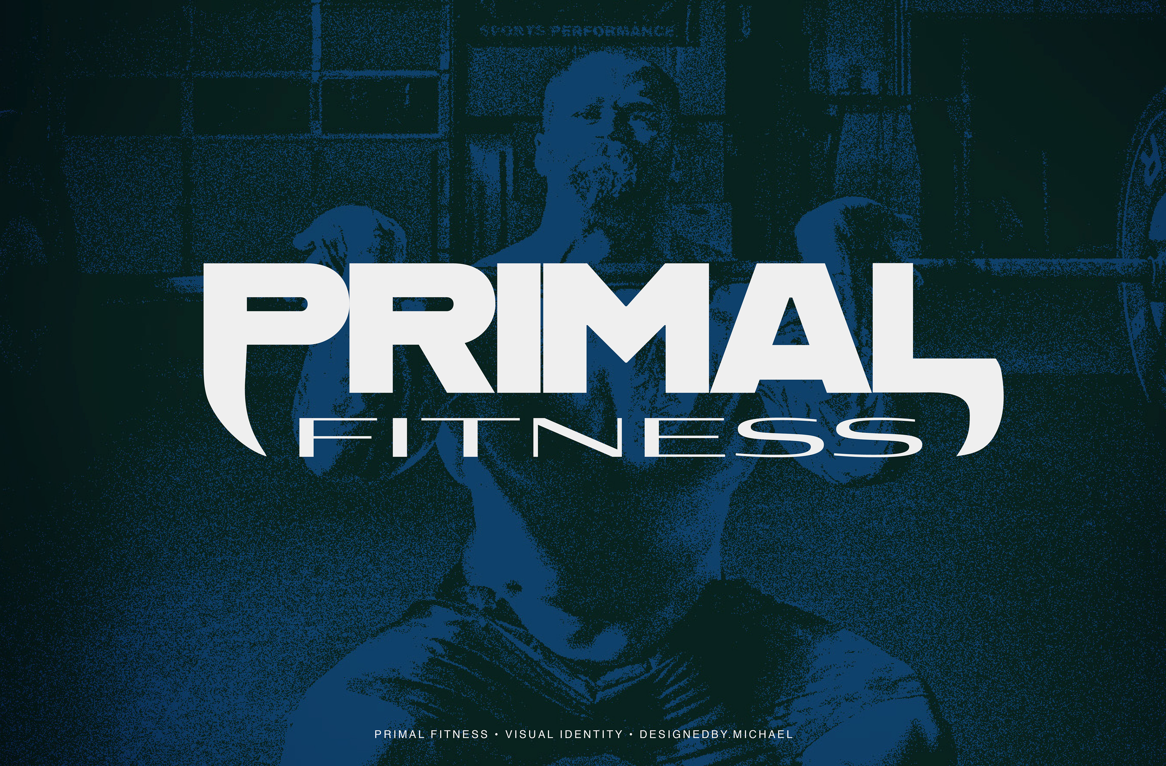
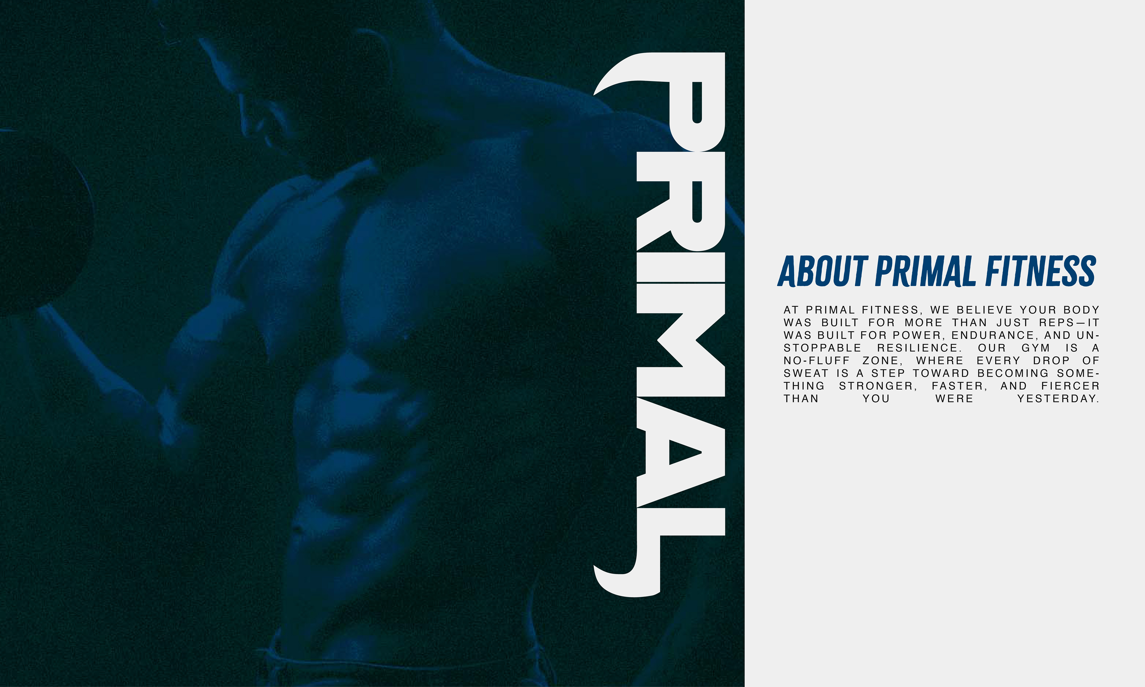
With Primal Fitness' visual identity, I've crafted a branding ecosystem that communicates raw power and primal energy through every element.
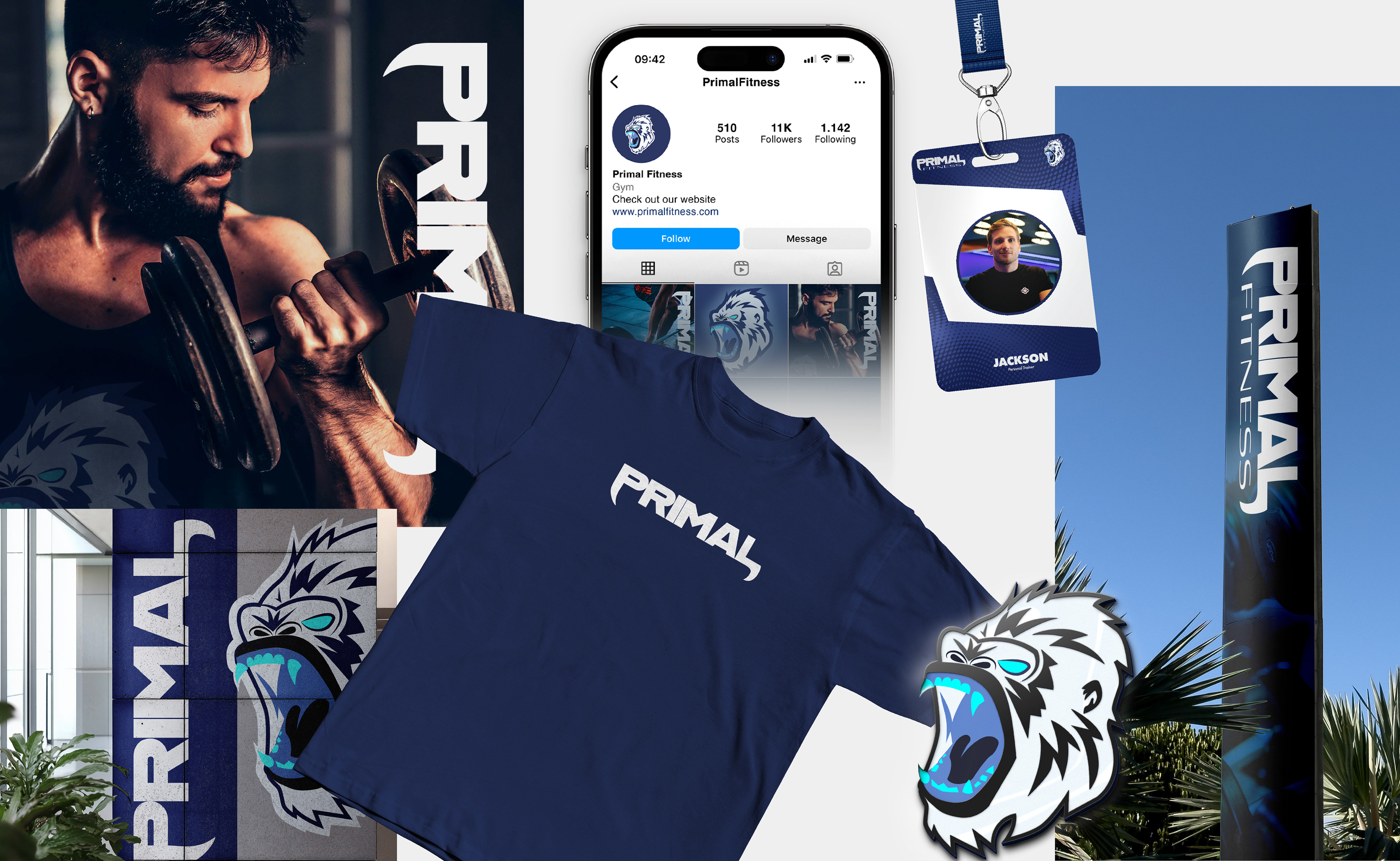
The logos establish a hierarchy of presence, the primary logo's rugged typography stands as an unshakable monument to strength, while the secondary version offers adaptable ferocity.
The Yeti mascot isn't just decoration; it's the embodiment of our untamed training philosophy, serving as both spirit animal and challenge to members. This system works cohesively to tell our story: where modern athletic discipline meets the unforgiving intensity of nature.
These choices reinforce that Primal Fitness isn't just a gym, but a proving ground for those willing to push beyond human limits.
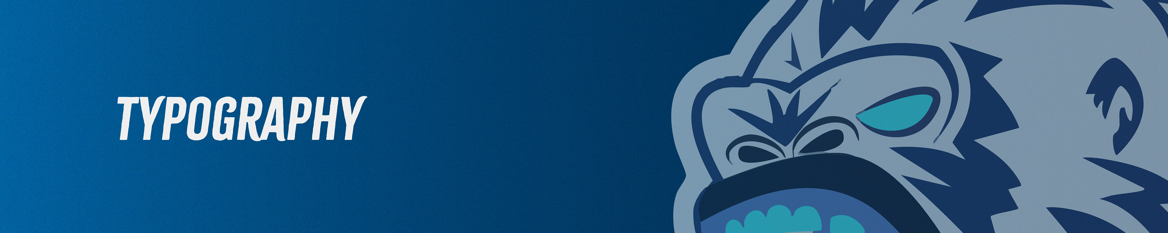
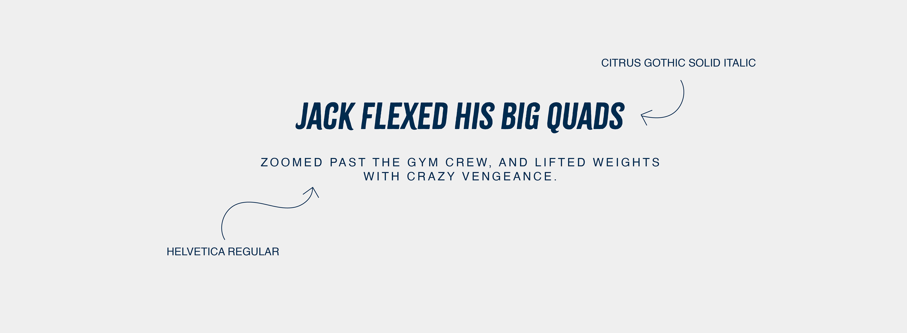
Primal Fitness’s typography strikes with the same raw intensity as our training—where bold, unapologetic strength meets razor-sharp precision.
Citrus Gothic’s aggressive slant embodies unstoppable motion, while Helvetica’s clean rigidity grounds our no-nonsense approach.
These fonts don’t just speak; they roar.
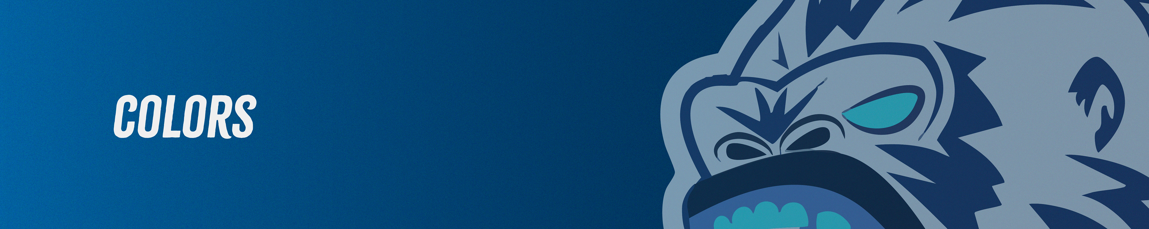
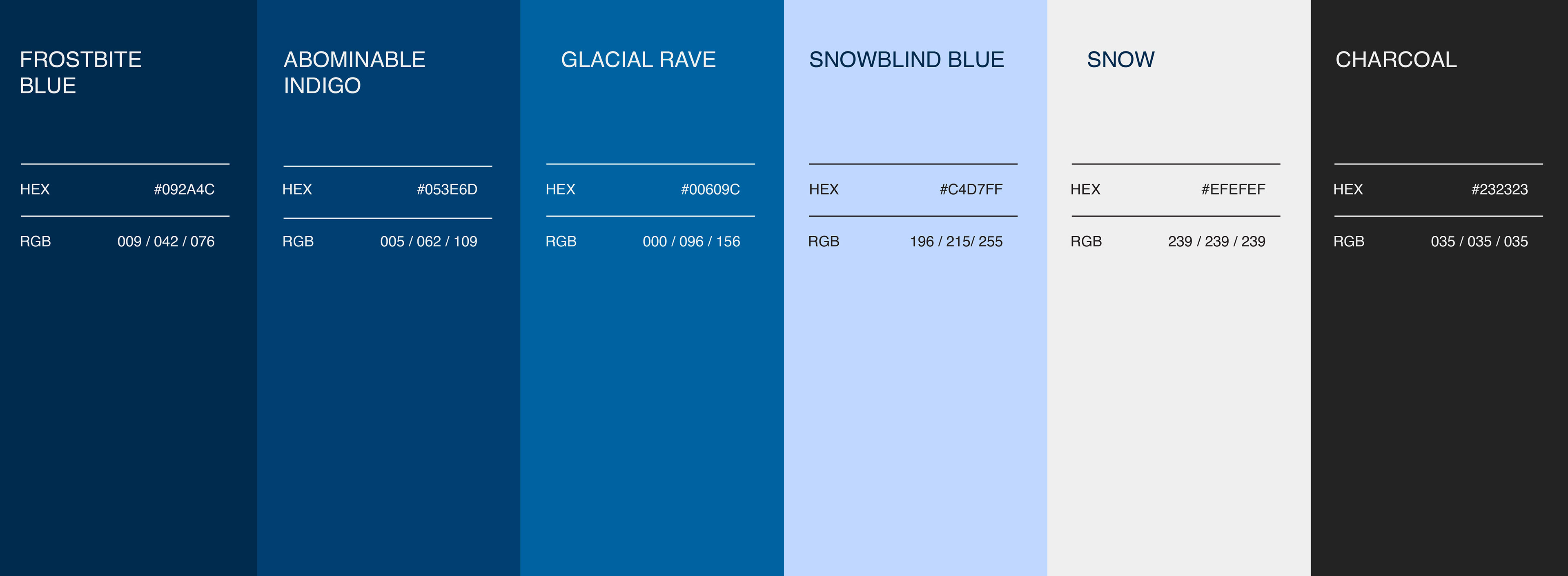
Primal Fitness’s color palette is a fusion of untamed power and icy resilience. Where deep, glacial blues meet stark contrasts, mirroring the raw intensity of nature and the unbreakable strength of those who train here.
These aren’t just colors, they’re the essence of the hunt, the storm, and the relentless pursuit of growth."